13A Final Portfolio

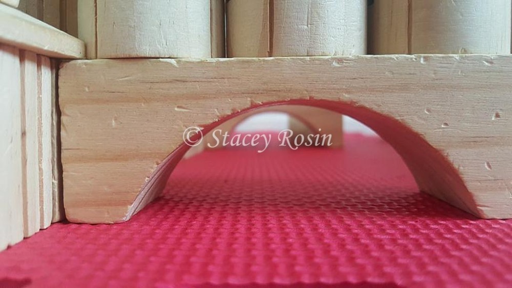
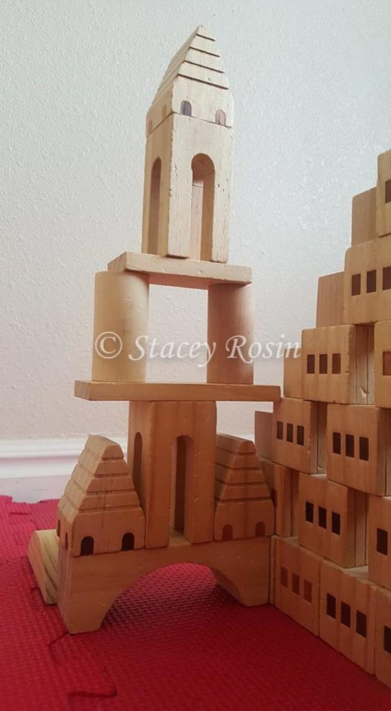
Process: I started by editing my projects based on the nets I received from my professor, Sister Larson. I placed a colored shape behind the title of my event poster and I created more space between the information and the design element to create adequate white space. I edited the design element on my typography project to align with the title. I made a similar correction on my web design by moving the content closer to the navigation bar and adjusting the rest of the content accordingly. I also change some of the text to a darker color on my web design. I adjusted the lead on the information portion of my movie poster – decreasing the space – and adjusting the text within the space. On my slide project I redesigned one slide to reflect Sister Larson’s suggestion to place a diamond shape with text right in the middle of the slide. I spent most of my editing time on my photography project. I tried to create more contrast in my images and I added an image to my collage that was suggested (a spiral cone-shaped block). I then placed the images on Powerpoint slides. I created 10 slides with similar design elements and varied the placement of the elements and labels. I maintained continuity between slides by using a base color and accentuate the design I on the slide by using its dominant color as an accent color on the slide. While uploading the presentation to slideshare.net I encountered a problem with formatting that was reconciled by turning each slide into a jpeg and creating a new slide presentation to upload.

My audience is any person interested in design and future employers.

Critique: Cheryl Meinen said, “Looks great! I would change slide 4 and 6 background to grey so it would match all the other slides though.” Shelley Guthrie Tiffany added, “The one slide where the arrow is under the text label feels a little off. It competes for attention with the text. Consider placing it like the other slides. Nice job! Judy Daines said, “Slide 7 – the title “movie poster” is over the arrow, otherwise I think it is awesome! Love your slogans, now I need to think for mine!

Based on Cheryl’s critique I did change the two slides to a gray background to match the others and to maintain continuity. Based on Shelley and Judy’s suggestion I moved the arrow design element on slide 7 out from under the title, but kept it slightly under the end of the title.

Color scheme: Triadic (Brick, Lime and Indigo)

Font:  Title/Headings – Copperplate Gothic Bold (slab serif) & Subtitles – Gabriola (script)

12A Magazine Spread Draft Critique

I started my magazine layout by creating sketches to include my images and body copy. Once I chose a sketch I made a shape map on Indesign which helped to simplify and tweak my design. I used black boxes to represent the images and quote placement and I used place holder text throughout the body. I tried several different design elements and fonts. In week seven I wrote the article and chose my images. Once I placed the images and place holder text I knew I would need to edit my article for space. I used the dropper to extract colors from my image of Christ and decided to stay with a monochromatic scheme (brick).

Welcome to my work in progress!

12AStaceyRosin


Sketch

Fonts:  Title – Edwardian Script ITC (Script) and Body Copy – Avenir Book (Sans Serif)

Image Sources:

Simon Dewey Image: http://1.bp.blogspot.com/_3PsrzVHfA/U0k3tXXdO8I/AAAAAAAAAK0/4K1RbFz9z0I/s1600/LeadKindlyLight.jpg
Prayer Image: http://biblestudyinsider.com/files/2013/05/145244798.jpg


11A Web Layout

11AStaceyRosin


11A-ShapeMap-StaceyRosin


11A-Sketches-StaceyRosin


Message: My project is to promote Michigan. Michigan is a beautiful state with incredible natural resources and wonderful tourist attractions that many people are unaware. My audience is anyone interested in travel within the United States. I wanted to show the beautiful places, events and activities there are to enjoy. I chose pictures that feature some of Michigan’s unique treasures.

Process: I started my process by choosing pictures that fit in my sketch. I had decided to focus on blue skies and blue waters. I wanted to use a monochromatic color scheme of blue to enhance the “Pure Michigan” logo. I gathered pictures of places that demonstrate the best of what Michigan has to offer. I also found extras in blue such as a Michigan map and social media icons. I filled in my shape map fine tuning as I went and adding new ideas as they developed.

Color Scheme: Monochromatic (Blue)

Font:  Text and partial title – Shree Devanagari 714 Bold (Sans Serif)

Title “M” –  Edwardian Script ITC Regular (Script)

Critique: My critiques include on e of my sketch/shape map and three of my design at 905 completion. Claire Adney said, “I really like the simplicity of your shape map! It will help with navigation. Sara Arend said, “I honestly think that this is dang good. I like the little michigan next to the search bar. The only thing I can think of or see is the weather box at the bottom, it seems empty compared to everything else.” Cheryl Meinen, “I love that you did Michigan as that is where I was born! I love that all the pictures are blue! I would separate the links from the top picture so it would look more like the bottom blue rectangle. I agree with Sara, your weather box needs either a picture or text so it will not look so empty. The picture in the bottom middle only has one line and the others have two so maybe put more info so they will all match.Good job!” Nancy Wells said, “This is beautiful! (I live in Michigan.) I love your photos! The only thing I would change would be to make your text under the photos the same dark blue as the rest of your blues, because they are hard to read being so light. Also, remember to remove your background when you are finished.”

I found all of the critiques helpful. Sara and Cheryl both commented on the weather box at the bottom of my page and it motivated me to be creative and add elements that I had been planning to add.

Image Links:

https://greatlakesgazette.files.wordpress.com/2012/01/sleeping-bear_3672.

https://www.med.umich.edu/intmed/cme/images/grandhotel2.

http://mitechnews.com/wp-content/uploads/2015/11/Jordan_River_glory.
bridge: http://comfortablydomestic.com/wp-content/uploads/2011/08/p7222754edited1.
Bavarian: http://media2.trover.com/T/547c1e52d809d870b0003c69/fixedw_large_4x.

Holland: https://karilynnphotography.files.wordpress.com/2010/04/img_6414version2wtmk.

Pictured rocks: https://woodhavenchronicles.files.wordpress.com/2014/09/dsc_2168.

https://www.oldausable.com/media/wysiwyg/RiverPics/IMG_2448.

http://www.casscollision.com/images/State_Map_of_Michigan.

Social Media Icons:http://freesocialicons.com/wp-content/uploads/2014/11/social_icons.

Clouds: http://www.michigan.org/images/weather/07-s.

10A Movie Poster Project

10AStaceyRosin


Message/Audience: Once I realized that the project had to include an image of me I knew I had to proceed with a comedic approach. I love musicals and recently played the role of Dolly Levi in Hello Dolly. Thus, I strapped on my sequins and feathers and took a picture of myself. In the name of comedy I decided to use a play on words and instead of “Hello Dolly” I chose “Hello Bali”. I wanted the poster to have a retro feeling to appear similar to the movie posters for  “Hello Dolly “and “Road to Bali” which both used vibrant colors. I also wanted to show a side of me that few people know in my new home – the side that loves musicals, classic comedies and adventure. Living in a new town can make you feel like a stranger to all, and so, I wanted my audience to be anyone interested in getting to know me or anyone who shares my love of musicals, classic movies, humor and fun. So, I took the photo of myself and edited it in Photoshop. I started with cutting the background from my Dolly image and placing it on an iconic photo of Bali. I resized my image and attempted to blend the two images together. I added a title experimenting with different effects. I then added an explanation of my movie and listed myself as the lead. Once I felt I had taken the poster as far as I could I posted it on Facebook for critiques.

Critiques: My first critique was from Sister Larson. She suggested removing my name from the center the image next to my head and I did so and was pleased with the results because it seemed to improve the flow of the poster. She also noted that the background was very vibrant and the image of me dull in comparison. She suggested that I find a way to improve the blend between the two images. So, I watched a few how to video regarding Photoshop and decided to go with a color tint. I used the dropper to extract color from my dress in the image and created a tint that covered the background layer. I adjusted the opacity to make the tint very light. I also added a posterized effect to the entire project. I played with other layers and adjustments, but felt that I had balanced the vibrance between the two images.Shelley Tiffany said, “Fantastic! So colorful. All the images are blended well. Good use of contrasting fonts in the title. The bottom text is just a little hard to read. Maybe put a rectangle behind it and blur somehow??” I appreciated her enthusiasm and attempted to place a rectangle behind the text but was unable to adjust it beyond the point of distraction. Once I placed the color tint I felt the text was easier to read – especially when the image was poster size.

Fonts:  Snell Roundhand Bold (Script), Phosphate Inline (Decorative), Movie Poster Font (Sans Serif)

Images:

I took the image of me as Dolly.

Image of Bali:  https://images6.alphacoders.com/521/521630.jpg

9A Photographic Study Project

8C LFC Photo Activity-8


8C LFC Photo Activity-11


8C LFC Photo Activity-13


8C LFC Photo Activity-9


8C LFC Photo Activity-17


8C LFC Photo Activity-16


9AStaceyRosin


Process: I struggled to find a subject for our perspective of 12 project, but I was inspired by my children playing with blocks. I would hope that children of all ages (0 to 110) will enjoy my pictures.The natural light that poured through the window next to their play area was an added benefit and inspiration. I took the photos from several angles and then edited them in Lightroom. I am still learning the program, and so, I focused mostly on clarity, sharpening, highlights and shadows. I created a collage using Photoshop for the first time. It was challenging to learn the process of inserting images and creating masks, but by the third time I felt more confident. I chose to use the dropper to select my background color and ended up choosing from the shadows of the red to have a darker color. I chose the color of the text using the dropper to gather from the blocks in my images. I chose Palatino Bold for my font because it is easy to read and its simplicity felt childlike and the serif made it feel just medieval enough for castle building.

Critiques:I posted my collage on Facebook for critiques and Serene Peterson suggested taking an image from the bottom looking up. I did attempt a phot like this but never liked it well enough to include it in my project. I have one image that looks through the bottom front to the bottom rear, but that was as close as I came. Claire Adney said she liked my choice of subject. She and Lori Hamblin especially liked the image of the unorganized blocks in my collage and so I included two more images with a pile of blocks in the foreground with my large images. As always I value the critiques because they are constructive and encouraging.


8C LFC Photography Project

Outdoor Light

8C LFC Photo Activity-4


Indoor Light

8C LFC Photo Activity-2


Foreground Focus

8C LFC Photo Activity-7

Background Focus

8C LFC Photo Activity-6

Rule of Thirds

8C LFC Photo Activity-5


Lead Room

8C LFC Photo Activity


I enjoyed learning how to focus and preserve the color of the sky. My out door picture was taken in my back yard just before sunset. The indoor photo was taken of my daughter as she napped in our living room with the natural light coming through the nearby window. The foreground and background photos were taken in my home and I enjoyed learning how to change the focus and think that I may hang one of those on my wall or both. The rule of thirds image was taken in the YMCA gym in the bouldering cave – the climbers were captivating and created the perfect setting for the image. My lead room photo was composed in my dining room with my see no evil, hear no evil, speak no evil owls as the subjects.

I then took my images to Lightroom and struggled a bit at first to learn the program, but eventually enjoyed editing and watermarking the images. Now that I am more familiar with the program I believe I would enjoy it even more.


8A Social Media Marketing Project

Company: Babyganics
Object: To increase consumer awareness about Babyganics’ chlorine free, plant-based, ultra absorbent diapers made from natural & renewable resources.
Strategy: Create a Facebook profile image, cover image, and three supporting posts.

Screen Shot 2016-02-25 at 10.21.45 PM


Screen Shot 2016-02-25 at 10.22.15 PM


Screen Shot 2016-02-25 at 10.22.43 PM


Screen Shot 2016-02-25 at 5.01.03 PM


Process and Reasoning: I chose Babyganics because I wanted to represent a company that provides great products and spread awareness. Babyganics uses bright colors and pictures of babies in their advertisements, and so, I chose to stick with their bright theme using a tetradic color scheme of green, blue, red and orange. I used Babyganics catch-phrases “baby-safe” and “grow boldly”. I wanted to appeal to young parents (20 to 45) who are concerned with choosing baby-safe and eco-friendly diapers.

I tried to create a message that is cheerful and childlike. I created the images by inserting images into Word and adding text and color. I chose to use Bauhaus 93 font as it was round and bold and easy to read. I also chose not to use capital letters on my images to follow the trend of the company and to appear child-like.  I changed my images from pdf to jpg, created a temporary Facebook page, posted my profile and cover images and three supporting images and text. I then took screen shots to share for critiques and my blog post.

Critiques: Shelley Tiffany noticed that I needed to add text to one of my images and I gratefully added the text. Rebecca Jones and Nancy Wells suggested that I darken the color in my text box to help the white font stand out – I agreed and altered the image. Shelley, Rebecca and Nancy were all very complimentary of my design.

Mouse Image:https://sits-pod22.demandware.net/dw/image/v2/AAMK_PRD/on/demandware.static/Sites-Carters-Site/Sites-carters_master_catalog/default/dwb3a2dbad/hi-res/121B914_Default.jpg?sw=2000&sh=2000

Breakfast Image: http://babyganics.com/assets/artwork/homepage/hero-breakfast.
Boy Playing Image: http://babyganics.com/assets/artwork/homepage/hero-indoors.
Diaper Image: http://c2.q-assets.com/images/products/p/bg/bg-244b_1z.
Diaper Image: http://shopwithmemama.com/wp-content/uploads/2013/06/2013-06-28_1248.

Magazine Spread Project

For our magazine layout I chose to write an article for the Ensign with adult readers in mind. The nature of the article is personal and timely. I decided to use pictures from the internet due to the nature of the article. I fought the impression to write this message until the idea was overwhelming and I was unable to proceed with anything else. I began with the sketches you see below and then created a shape map in Indesign. I put placeholder text and images in place. Once I adjusted the layout, I inserted my body copy and began to readjust and edit my story for space.


Sketch

12AStaceyRosin-Shapemap


Here is my final project. It is obvious that many things changed from my text and even a few from my shape map. I had originally intended to use a complimentary color scheme of brick and teal, but once I began to us the colors in Indesign I decided to change to a monochromatic color scheme using brick. I wanted my article to portray a peaceful setting to enhance my story. I also wanted it to appear simple and elegant. I think that images work well with my story and that the color scheme keeps the focus on the message. I really enjoyed this project and using Indesign.

12BStaceyRosin

Critique: Dee Wightman and Carrie Fort suggested changing my title font to something more elegant and that would stand out more. Dee also suggested stretching the design element to fit under the entire title. I really liked their suggestions and feel that they were just what my design needed. Dee also suggested using a color strip with my title using a color from the image of the Savior or using a repeating element of the light he is holding somewhere else in your spread. I decided not to add a color strip or other design element because I felt it took away from my overall design. Dee suggested tightening the space around my quote in the third column to enable me to add my author info to the end of the third column. I did move my name to below the title and aligned it with the body copy and placed my residence below the third column – I liked the changed significantly.

Sister Larson advised me to remove the design element surrounding my quote or to fill it with color and use a contrasting text. I tried both and like it without a design element. Sister Larson also pointed out that the font of my place of residence was larger than my body copy and so I reduced the size.

Fonts: Title – Edwardian Script ITC (Script) and Body Copy – Avenir Book (Sans Serif)

Color Scheme: Monochromatic Brick

Image sources:

Simon Dewey Image: http://1.bp.blogspot.com/_3PsrzVHfA/U0k3tXXdO8I/AAAAAAAAAK0/4K1RbFz9z0I/s1600/LeadKindlyLight.jpg
Prayer Image: http://biblestudyinsider.com/files/2013/05/145244798.jpg

6A Slide Design Project

“An High Priest of Good Things to Come” by Jeffrey R. Holland

Outline:

When trials come…there is the promise of good things to come.

There is

  • Help
  • Happiness
  • Light
    (There really is light at the end of the tunnel. It is the Light of the World, the Bright and Morning Star,the “light that is endless, that can never be darkened.” It is the very Son of God Himself.)
  • Hope

To any who may be struggling…

  • Hold on.
  • Keep Trying.

Process:

I knew I wanted to choose dynamic images and so I needed a dynamic talk. The thought of “dynamic” brought Elder Jeffrey R. Holland to mind. I chose this talk because he talks about the Savior being the light of the world. I couldn’t get the thought of bright rays of sunlight out of my mind. So, I searched for vibrant images of sunlight. I was blessed to find amazing pictures and the words from Elder Holland’s talk leaped out at me. I wanted the presentation to be as inspiring as his witness of Christ. Once I chose the images and placed the text I had a hard time choosing a shape or design element to enhance the design. I chose a diamond, but I didn’t want it to overpower the images.


12705616_162115704167954_7944509405671880739_n

Critique:

The critiques were incredibly helpful. Judy Daines, Margery Sabolsky, Paul Duhacek offered   very positive feedback that reassured me about the basic elements of my design. Lisa Hauck Wilkinson and Shelley Tiffany both addressed elements of my design that I was concerned with – the diamond shape and the visibility of the text. I experimented with changing the shape and font color and submitted my design for a critique by Sister Larson. Sister Larson’s critique was very helpful. She suggested I experiment with the size and transparency  of the shape. I have and I have also filled the text box with a slight tint to magnify the text.

Font: Avenir Next Regular (Sans Serif)

Color Scheme: Text and Design Elements are Complementary (Gold and Indigo) / Images are Tetradic (Indigo, Violet, Gold and Lime).

Link to talk: https://www.lds.org/general-conference/1999/10/an-high-priest-of-good-things-to-come?lang=eng

Image link: http://gravelhillumc.org/files/UI%20Images/Autumn-Sunrise-Wallpaper-05.jpg
Image link: http://7-/data_images/out/54/6956089-sunrise-mountain-scenery.jpg
Image link: http://casadelskorrdal.com/wp-content/uploads/2015/07/6776635-beautiful-sunrise-wallpaper.jpg
Image link: http://7-themes.com/data_images/out/72/7019348-sunrise-morning-mist.jpg


Image link: http://www.hdwallpaperscool.com/wp-content/uploads/2015/04/sunrise-desktop-background-high-definition-wallpaper.jpg
Image link: http://www.previnex.com/wp/wp-content/uploads/2015/04/field_sun_light_traces_road_awakening_52022_1920x1200.jpg

5A Event Flier Project


5AStaceyRosin-page-001


My design was created in Word.

Screen Shot 2016-02-04 at 10.36.54 PM


Process: Our assignment was to create a flier for a benefit event. The fun began when the assignment allowed us the creativity to invent our own event and sponsor. I decided to reach out to Harry Potter fans and sports advocates, ages 8 to 88. In my research I was happy to find that there is actually a strong quid ditch presence in the United States. I found a great image online of a “quidditch” broom and it fit perfectly with my “Nimbus 2000” sponsor. I was abler to use the dates and place from an actual approaching event – The US Quidditch World Cup! I decided to use colors that mimicked the photo and that represent greatest quidditch team ever, Gryffindor. I chose to use brick and gold and made the body copy a little on the orange-side to attempt to stick with an analogous color scheme – however in the conversion from pdf to jpg the orange turned more to gold – it apparently is a Gryffindor fan as well. I liked the way it looked so I didn’t attempt to change it. It seemed the notoriety of the colors would assist in drawing the attention of my potential audience. I placed three gold lines across the bottom of the image and top of the shape to imitate the three gold bands on the broom and to create a repeating design element. I wanted my fonts to be clear and easy to read, and so, I chose an Oldstyle for the title and San Seriff for the body copy. I enjoyed editing the logos and removing the background – the latest trick I’ve learned from my Visual Fundamentals class.

Critique Process: Nancy Wells, Lori Hamblin, Connie Chatelain and Alex Macfarlane offered positive comments about my design. I was concerned about the repeating design element (the gold lines) disrupting the flow, but their comments reassured me. Sabrina Speer suggested flipping the image to add balance to the design and I understood what she meant, because my design has the potential to feel heavy on the left side; however, I tried the to flip it and it didn’t feel like it enhanced the flow, so I decided to leave it. Sabrina also pointed out that the “US” in my title was a little confusing. It looked like the pronoun “us” rather than the abbreviation for United States. I didn’t add periods originally because the actually association doesn’t use them. I explained my dilemma and she suggested using a font that made it clear that they were capital letters. I took her advice and I definitely think it was an improvement. Sabrina and Shelley Tiffany both suggested aligning my title on the right side to balance the flow of my design. I tried it several different ways and chose to keep everything aligned on the left side. I absolutely appreciate the manner in which everyone is so positive and constructive in their critiques – it helps the unsure designer feel more comfortable sharing.

Color Scheme: Analogous: Brick, Orange (kind of), Gold

Fonts:  Title – Bookman Oldstyle (Oldstyle)  Body Copy – Calibri (Sans Serif)

Link to Logo: https://www.usquidditch.org/img/uploads/IQA_Logo_2013.jpg

Link to Nimbus 2000 Logo: 

Link to Image: http://torontoist.com/wp-content/uploads/2011/10/sportinggoodsquidditch1.jpg