Tasteful Typography Project

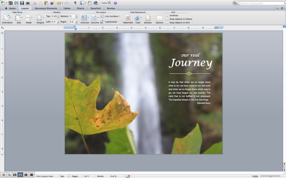
My project was designed in Word.

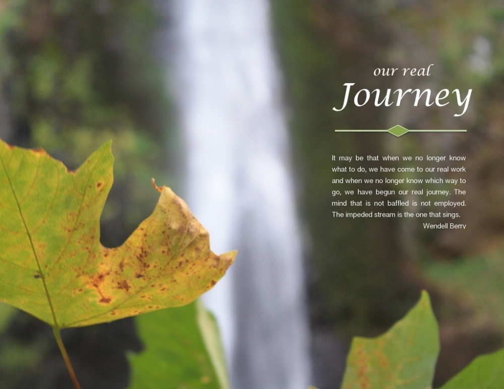
Process/Message: I wanted to use a quote by Wendell Berry, one of my favorite authors, about life or nature. I narrowed down the quotes to two, and chose a picture that I had taken on a trip to Oregon in October 2015. The picture helped me to finalize my quote selection. The quote discusses life’s obstacles and the opportunity each of us have for growth in perplexing times. I felt that the image demonstrated the beauty that can come to those that persevere. In the image a waterfall demonstrates the last line of the text that speaks of an impeded stream singing. I wanted to create a design that emulated that thought – I wanted it to sing.
The picture also helped to develop my design. The tips of the leaves pointed to the space I would place the quote directing the attention of the reader. The points accompanied by the direction of the waterfall create a flow toward the text. The waterfall and the leaves beginning their autumn transformation demonstrate a journey similar to the message conveyed in the text. I inserted the image into Microsoft Word, added three individual text boxes over the image and created a design element that pulled from the color of the leaves connecting the text to the image. I chose white for my text to ensure that the title and body copy contrasted with the dark background and were connected to the white of the waterfall. I tried to choose a simple font and size that created a soft contrast from the image to maintain the peaceful feeling I was attempting to convey. I spent a great deal of time with alignment hoping to achieve a similar flow to that of the waterfall in the image.
Complications: Once I was satisfied with my design, or at least had no idea how to improve it, I spent hours trying to overcome a formatting issue that cut off the edges of my design when saved as a PDF. Embracing the message of my project I kept trying until I finally was able to convert the file to a PDF and saved it as a JPG through the online converter. By 6:00 a.m. (up all night), I felt I had lived a night as the impeded stream and the completion was as the sweet song it sings. Once I received a few critiques, I went back several times to make changes and repeated the PDF and JPEG formatting each time.
Audience: My message is intended for an audience of students from the age of 8 to 108 – any student of a school, university or life who faces challenges. I wanted the design to evoke a feeling of peacefulness, and inspire the reader to embrace their challenges as an opportunity for growth.
Critique Report: The critique I received from classmates was so helpful in fine-tuning my design. The comments I received were positive and constructive. Margery Sabolsky pointed out that my margins didn’t seem to be set at .5 – an error that occurred in all of my formatting issues while attempting to save my design as a PDF. I changed the margins and adjusted the text on my design. Margery also pointed out that I didn’t need the quotation marks around my quote or the authors name. I removed the quotation marks, but decided to keep the authors name since it was optional and I wanted to encourage readers to seek out his writings. Cheryl Meinen also suggested that I change the alignment of the smaller words,”our real,” in my title so that they weren’t centered. After playing with the idea I decided to keep it as I had it because I felt it lead the reader into the flow of the text and I had originally decided to align the words that way to create a sort of mirror image of the waterfall beside it. The waterfall is narrow at the top and widens as the water pours into the stream, and I wanted to create the same appearance as the narrow title poured into the larger word,”Journey”. In addition to Margery and Cheryl’s helpful comments, Lori Hamblin and Shelley Tiffany added positive feedback that gave me the confidence to leave my design alone. I don’t think it would have ever felt finished if left to my own critique.
Image Source: Myself October 2015
Font Name/Category: Title: Lucida Calligraphy/Script
Body Copy: Kannada Sangam MN Regular/Sans Serif
